Table of Contents
Maps module
The plans module allows you to create a topology of your network to create a clear architecture of your infrastructure, which becomes dynamic and reacts before your very eyes.
Types of maps
There are several types of plan with different functions. You can also create folders to store plans.
Folders
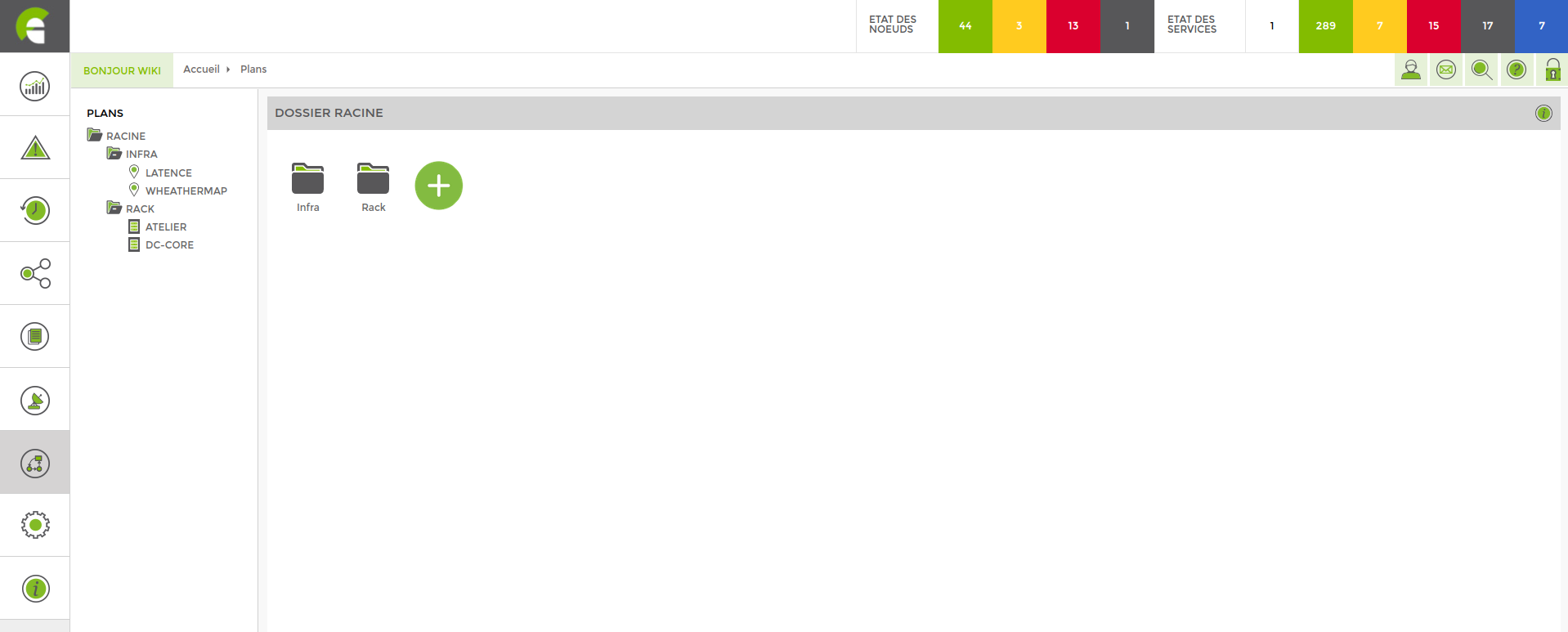
The purpose of folders is to classify our plans, but they also have a sharing function for user access. For a user to be able to view a plan, they must have access rights to it and also to its parent folders.
Image
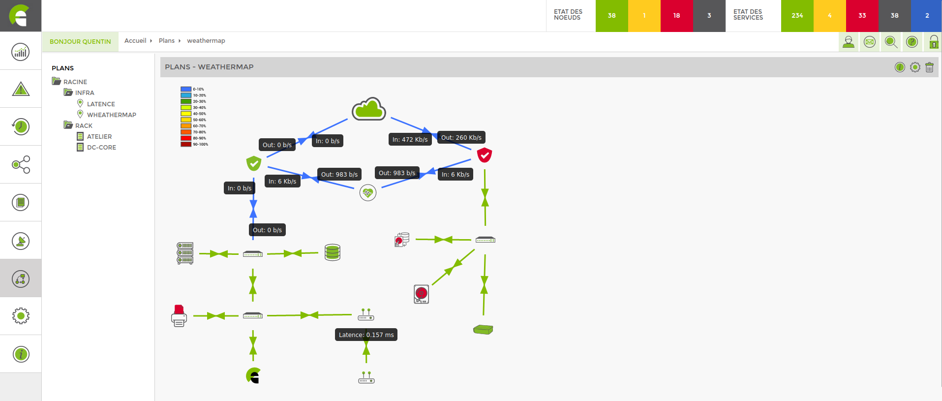
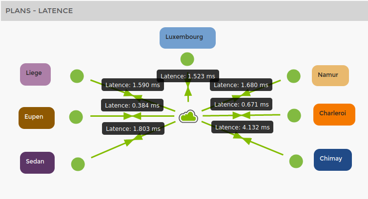
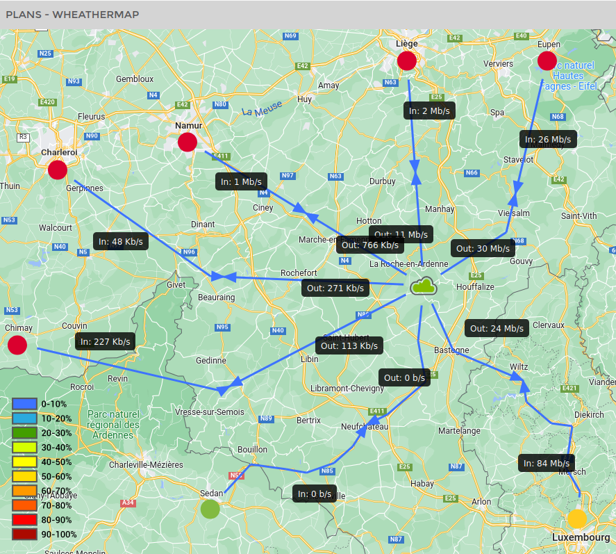
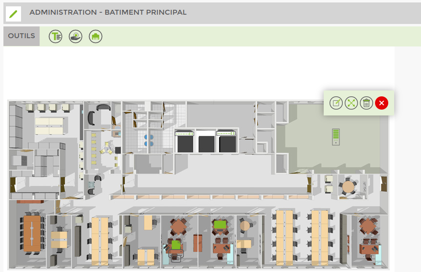
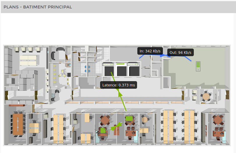
The image map is used to represent the different elements of the network and the links between them. This can be done on the basis of an image (of a building or premises) on which we position the various supervised equipment or without an image in a schematic way.
Here are a few examples:
Rack
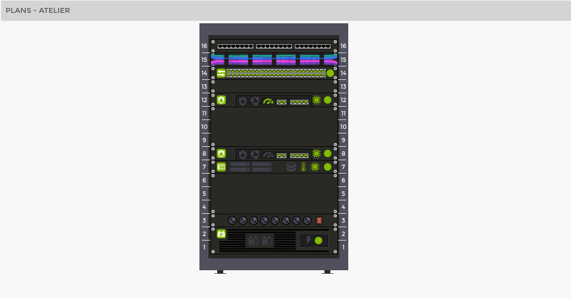
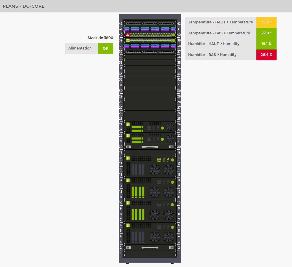
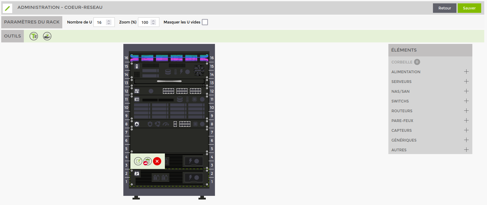
The rack map shows a network cabinet and all the equipment in it. You can choose the size of the rack and drag and drop the equipment onto the slots corresponding to your cabinet.
Here are a few examples:
Add a plan
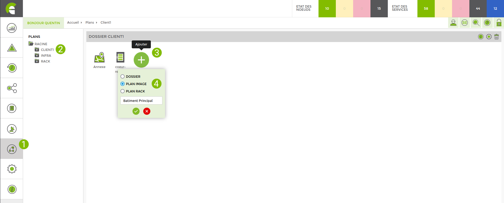
Here are the steps for creating a new plan or folder:
Go to the “Plans” menu

Go to the folder in which you wish to add a new map
Click on the “Add” button

In this menu :
1. choose the type of plan (or folder) to be created
2. Give it a name
3. Confirm

Then click on the plan you have created.

This will open the map in view mode.
You can then click on « Administration » ![]() to switch to edit mode.
to switch to edit mode.

Plan administration (modification)
In addition to the various administrative elements, you will notice that the map display itself is a little different from the view mode. This simplified display mode keeps the view clean and makes it easier to add and modify different elements.
In this mode, the status of the elements is not retrieved (everything is in green). For image maps, the status of links, arrows and their labels are not displayed.
General
These settings are available for all shot types.
Click on the ![]() icon to open the “General Modifications” menu.
icon to open the “General Modifications” menu.
- Change the plan name
- Change the folder plan
- Share the map with other users
- Set an automatic refresh period for view mode
Access rights
When you create a map (or folder), it is linked to your user who has the status « créateur » status. No one else can access it unless you choose to share it.
- Share as read : Gives access to the view mode only
- Share read & write : Gives access to view and administration mode
For another user to access your plan, they must be given one of these accesses to the plan, but they must also have rights in the interface (given by an administrator) see Managing user groups.
These rights are linked to the plan module:
- map_view : Read access to the map module and all folders and maps shared with this user.
- map_administration : Read and administrative access to the map module and all folders and maps shared with this user.
- map_create_folder : Authorises the creation of folders (requires map_administration)
- map_create_plan : Authorises the creation of plans (requires map_administration)
Note that a user with write access rights can suppress the access of other users except the creator, who can never be suppressed in terms of read & write rights.
Image maps
In addition to the parameters common to all types of shot, the 'General Modifications' menu for image shots lets you add a background image.
This section allows you to upload ![]() and/or choose a background image from one of the following two categories:
and/or choose a background image from one of the following two categories:
- General : Images uploaded in this category will be available in the administration of all image shots in your Esia (even by a user who does not have rights to the shot from which the upload was made).
- Link to this map: Images uploaded in this category will only be available on this map.
Save your plan frequently by clicking on the “Save” button in the top right-hand corner!
Dynamic points
Select a background image (or the white square for no image), then position the supervised elements by dragging the corresponding icons from the “ICONS” menu on the right to create dynamic points. Name them and confirm.
Once you have positioned and named your points, you still need to link them to supervision elements.
To do this, click on the dynamic point and a menu will appear:
<HTML>
  <style>
      .wrap_action-col-list img {vertical-align: middle !important;}
  </style>
</HTML>
 = > Display the screen for editing the item
 = > Resize the item
 = > Delete the item
 = > Close this menu
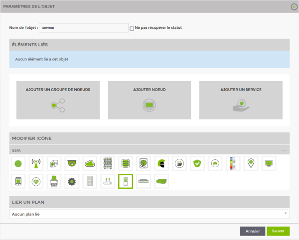
Click on ![]() to reach the next screen:
to reach the next screen:
Several elements can be linked to a point in the plan. These elements can be :
- A group of nodes
- A node
- A service
- Another plan
Add the elements whose status you want to display on this dynamic point. If any of these nodes, groups or services become critical or warning, the dynamic point will change colour (yellow or red) in the plan view.
You can also link a dynamic point to another map. In this case, if any of the elements represented on this other map go critical or warning, the dynamic point will change colour in the current map view.
Once you have finished modifying the element, click on “Save” in the bottom right-hand corner.
Repeat the same operation for all the dynamic points in your layout.
The modify button ![]() button at the top right of the icon menu lets you upload your own icons!
button at the top right of the icon menu lets you upload your own icons!
Links
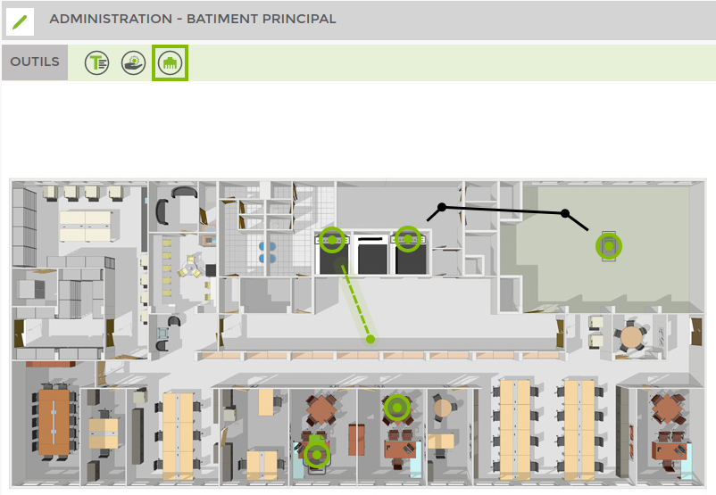
To link map points together, click on the « Lier » ![]() icon in the top toolbar.
icon in the top toolbar.
This tool is only available for image planes. When it is selected, you are in « Liaisons » mode, which displays the various possible link ports on the points of your plan. To create a link, simply click on a source port and hold the click while dragging to the destination port.
In this mode, you can also create points on your links that you can move to change the path the link takes. To delete a point on a link, select it and press the delete key on your keyboard.
Once you've completed your links, press the Escape key or re-click the « Lier » icon to exit this mode.
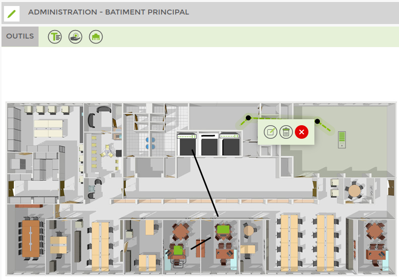
You can link services to links. To do this, click on a link to bring up the following menu:
<HTML>
  <style>
      .wrap_action-col-list img {vertical-align: middle !important;}
  </style>
</HTML>
 = > Display link modification screen
 = > Delete the link
 = > Close this menu
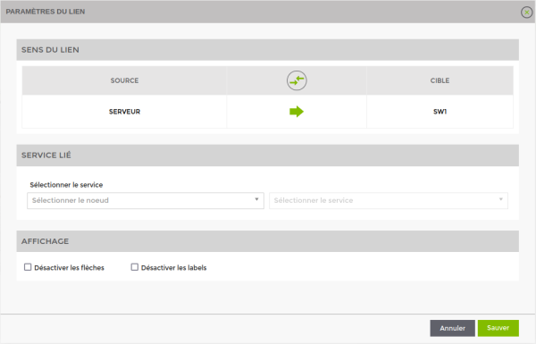
Click on ![]() to reach the next screen:
to reach the next screen:
- Link direction : Used to invert the labels of the In and Out values with a bandwidth service (interface service only).
- Linked Service : Used to select a service to be linked to this link.
- Display : Allows you to change the display of the link.
- Disable link arrows.
- Disable labels containing values (interface or ping service only).
Once you have finished modifying the link, click on “Save” at the bottom right.
There can be 3 different types of display depending on the service you are linking to:
- For a bandwidth service (interface) : the link takes on a colour representing the percentage of bandwidth used. Labels containing the In and Out values are displayed.
- For a latency service (ping) : the link takes on the colour of the service status. The label containing the latency value is displayed.
- For other services : the link takes the colour of the service status.
Rack plans
In addition to the settings common to all types of plan, rack plans have a “Rack settings” menu.
This menu is used to modify :
- The number of U contained in the cabinet
- Display size « Zoom »
- Hide empty U's to overwrite unused space
Save your plan frequently by clicking on the “Save” button in the top right-hand corner!
Rack elements
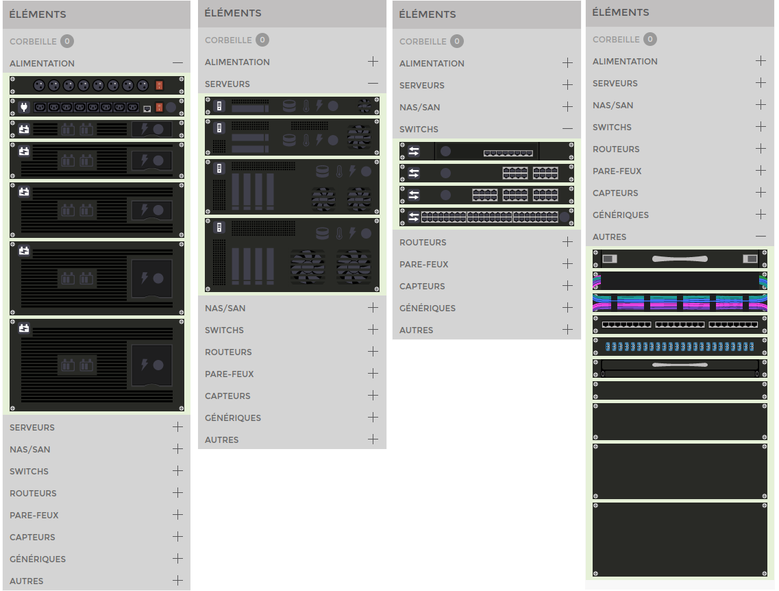
Set up your rack, then position the supervised elements by dragging the corresponding icons from the “Elements” menu on the right. These elements represent equipment and are available in different versions and sizes.
Once you have positioned your equipment, you still need to link it to the supervision elements.
To do this, click on the equipment to bring up this menu:
<HTML>
  <style>
      .wrap_action-col-list img {vertical-align: middle !important;}
  </style>
</HTML>
 = > Display the screen for editing the item
 = > Trash this item
 = > Close this menu
Click on ![]() to reach the next screen:
to reach the next screen:
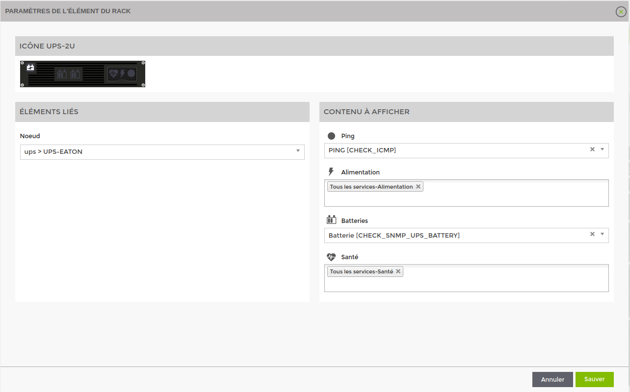
On this page, you must first choose the node to link behind this rack element. The list of nodes is filtered by node type. For example, for a UPS element you will only see UPS type nodes.
Then in « Contenu à afficher » for each icon, you can link services present on that node. For some icons, several services can be selected. In this case, the display will turn red if only one of the services is red.
The icon at the top left of the image (for UPS the battery icon) represents the global status of the linked node. If one of the services present on the node goes critical, this icon will turn red even if all the icons configured in « Contenu à afficher » are green.
Once you have completed your changes, click on 'Save' in the bottom right-hand corner.
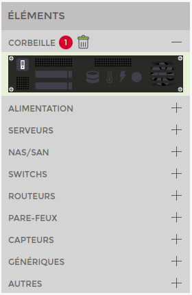
Recycle bin
An item in the rack is not deleted directly, but first goes to the recycle bin. An item is moved to the recycle bin in the following cases:
- In the item menu, click on

- If 2 items of equipment are superimposed on the same location, the one underneath is moved to the recycle bin.
- If you reduce the size of the rack and an item was positioned in a deleted slot.
When an item is in the recycle bin, you can retrieve it and drag it to a slot on the rack. Its previous configuration (node and related services) is still applied.
You can also permanently delete all in the recycle bin by clicking on the icon ![]() icon next to the title « Corbeille »
icon next to the title « Corbeille »
Tools
The following tools are available for all shot types. Unlike the the tool << Lier >> tool, which is only available for image shots.
Text
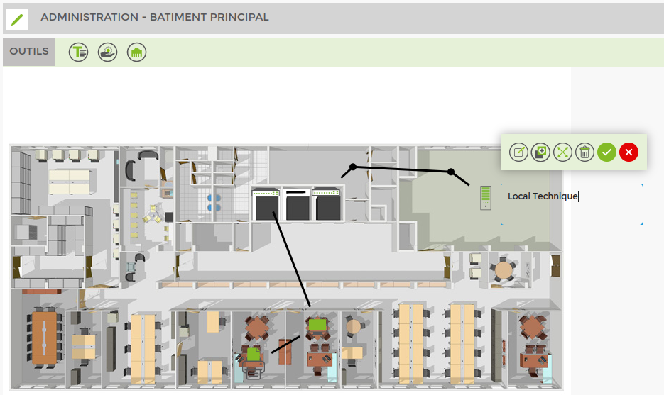
Use the text tool to add annotations to your shots. To create a block of text, click on the « Texte » in the toolbar at the top.
Then click on your plan at the point where you want to create the text block. Enter your text and confirm ![]() .
.
Clicking on a text element allows you to modify it and will bring up the following menu:
<HTML>
  <style>
      .wrap_action-col-list img {vertical-align: middle !important;}
  </style>
</HTML>
 = > Display the screen for editing the item
= > Duplicate the item
 = > Resize the item
 = > Delete item
 = > Confirm text changes
 = > Close this menu and cancel text changes
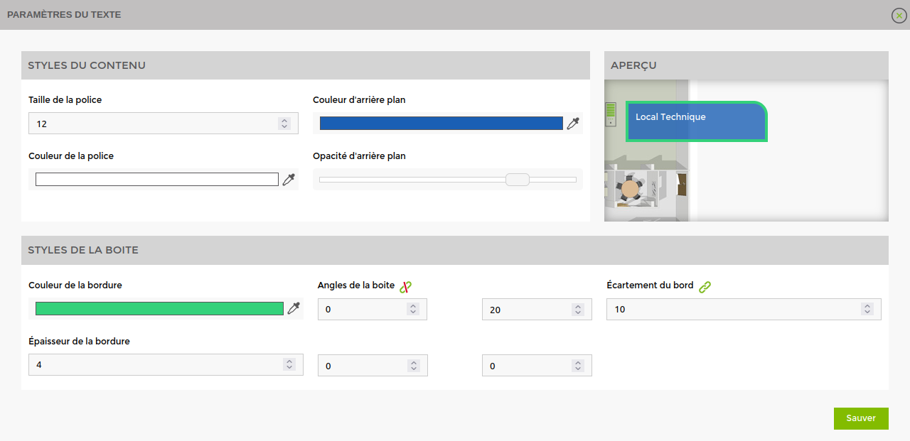
You can style the text element by clicking on ![]() to get to the next screen:
to get to the next screen:
The preview lets you see the changes in real time.
Once you have completed your changes, click on “Save” in the bottom right-hand corner.
Service
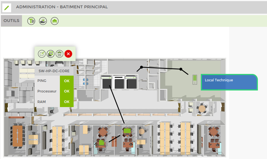
The service tool lets you add data about services. To do this, click on the tool icon « Service » in the toolbar at the top.
Then click on your plan at the point where you want to create the service block. This will automatically open the configuration window, but you can also open this window by clicking on an existing service element to bring up the following menu:
<HTML>
  <style>
      .wrap_action-col-list img {vertical-align: middle !important;}
  </style>
</HTML>
 = > Display the screen for editing the item
= > Duplicate the item
 = > Delete the item
 = > Close this menu
Open the configuration window by clicking on ![]() to reach the following screen:
to reach the following screen:
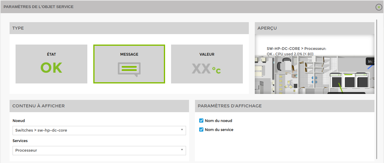
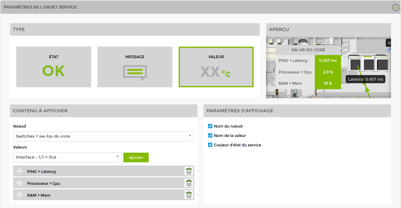
Type : Select the type of content to display :
1. Service status (ok, alert, critical, …)
2. Service message: creates an equivalent to the text tool, the content of which is the service message
3. Service value: used to select values retrieved by services (2.0 %, 0.407 ms, etc.).
Preview : allows you to see the changes made live
Content to display : select the node and the services or values to be displayed. State & Value: create a table with one or more data items
The other sections allow you to style the content
Once you have completed your changes, click on 'Save' in the bottom right-hand corner.
Example of configuration for type « Message » :
Example of configuration for the « Valeur » :

